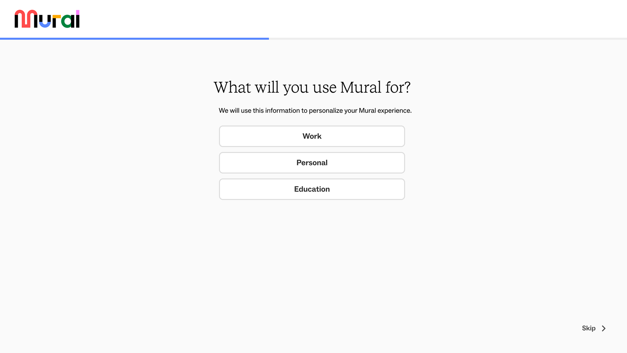
By September 2024, MURAL was facing an alarming decline in user acquisition, with sign-ups down 26% month-over-month and 61% year-over-year. While multiple teams were mobilizing around the broader growth challenge, my team took ownership of the authentication experience as the highest-leverage surface to address.
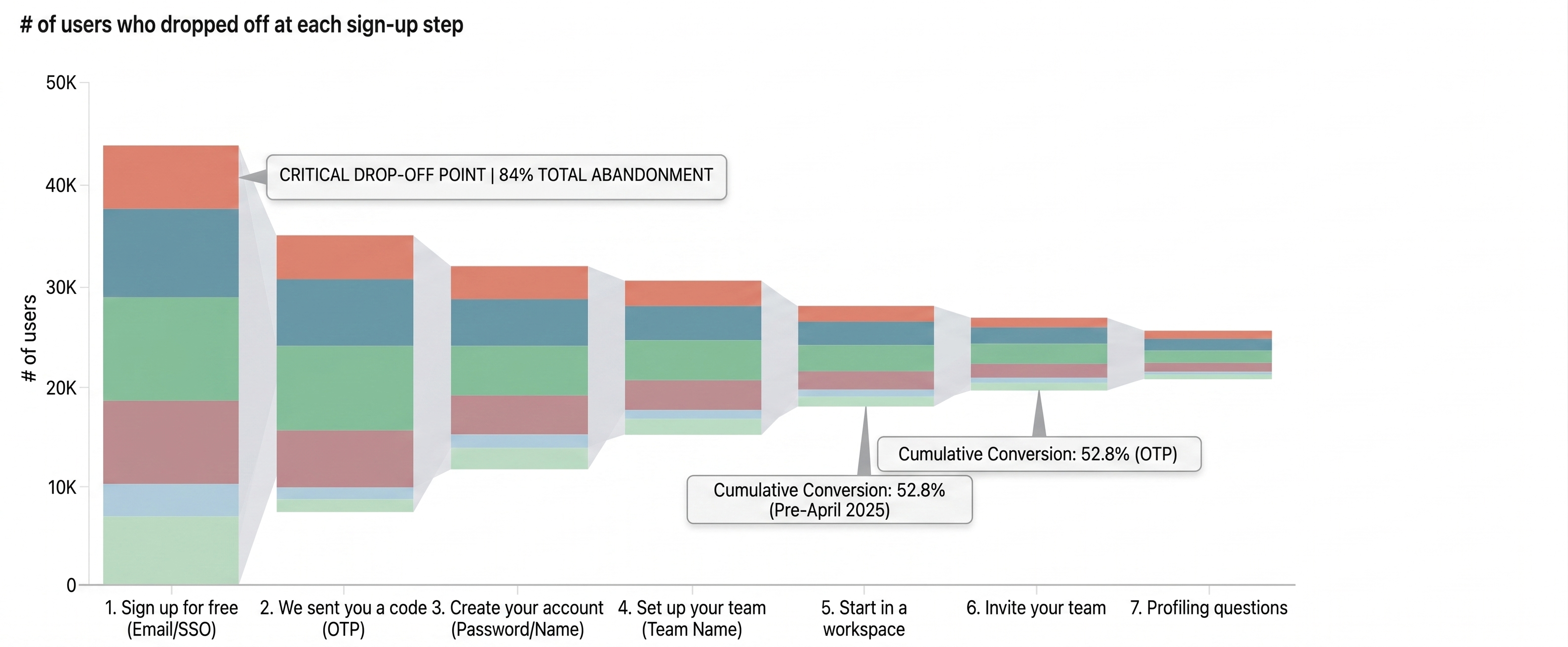
Funnel analysis revealed the root cause: only 52% of users who reached the signup page completed the full signup flow, with the first screen alone responsible for 84% of all drop-off. There was too much friction embedded in a flow built on technical debt, broken edge cases, and no coherent design vision.
I reframed the problem early: this wasn't a UI refresh, it was a product problem that needed both a short-term recovery plan and a longer-term approach. Trying to do both at once would have meant shipping polish on top of a broken foundation. Instead, I defined a phased strategy: stabilize first, then rebuild.
- Critical bug fixes
- Broken edge cases
- Missing SSO flows
- Outdated reCAPTCHA
- Design system alignment
- Accessibility review
- Responsive implementation
- Standardized interaction patterns
Before any design work started, I aligned stakeholders across engineering, product, legal, customer success, marketing, and content on goals, constraints, and dependencies. I partnered with the analytics lead to instrument every KPI from the beginning, so that every decision we shipped was data-informed and measurable.
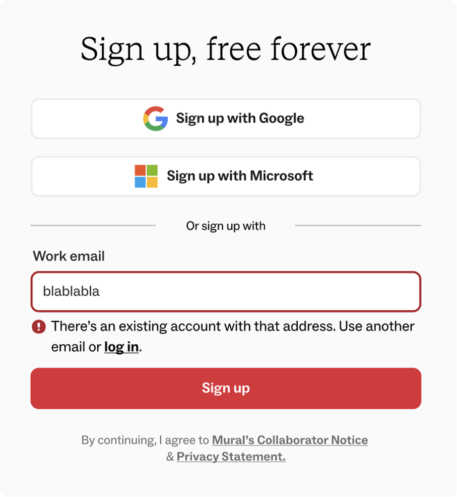
The temptation was to redesign everything at once, which I pushed back on and proposed a two-phase approach: Phase 1 was focused on resolving the critical failures causing immediate abandonment: bugs, broken flows, missing SSO, outdated reCAPTCHA.
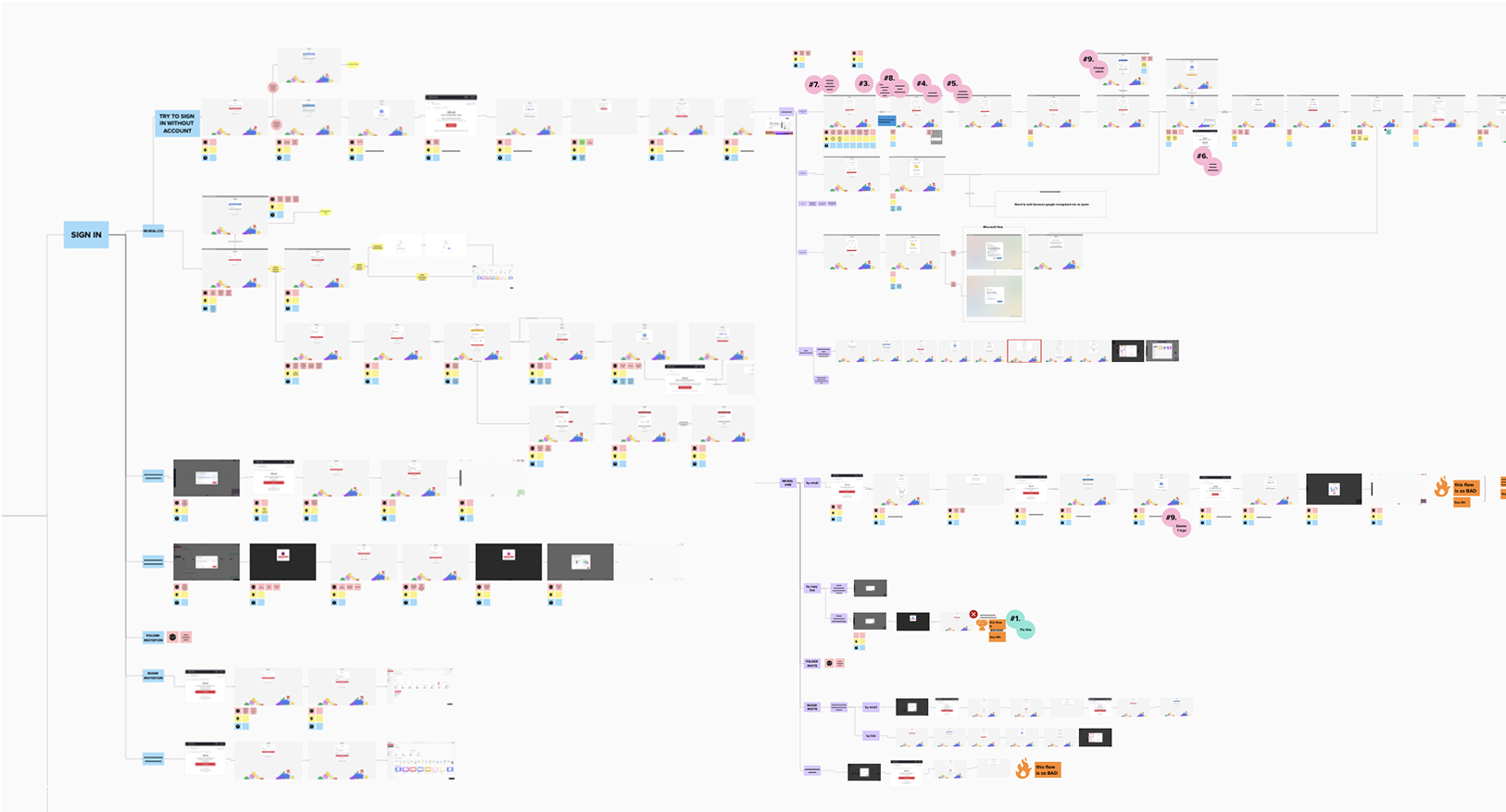
This was engineering-heavy work, which gave us time to map out all the existing sign-up flows and define a roadmap for phase 2. Phase 2 was the strategic redesign. This sequencing reduced risk and let us ship impactful improvements fast while setting up a cleaner foundation for the bigger work.
Phase 2 meant holding a high bar for visual and interaction quality through the most thorough adoption of MURAL's design system, across a flow that had been neglected for years.
Some key work included:
Standardizing interaction patterns across the entire flow to reduce cognitive load and build the kind of consistency that makes a product feel trustworthy at exactly the moment users are deciding whether to sign up. We had a considerably mature design system in place, but it hadn't been applied properly to the authentication flow. So we applied it and even contributed to it by developing new UI elements.
 before
after
before
after
Accessibility: We had accessibility commitments by contract with some customers that were at risk, so we made sure every screen we launched met A11y requirements.
Responsiveness: We needed to support users consuming MURAL's content from their phones. Authentication on mobile was a must, so we made everything responsive.
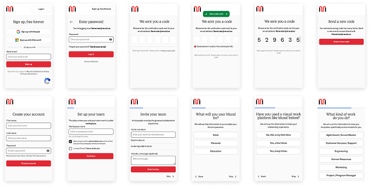
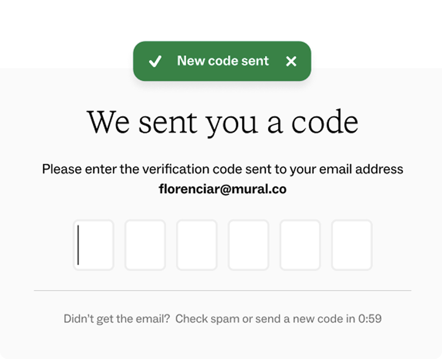
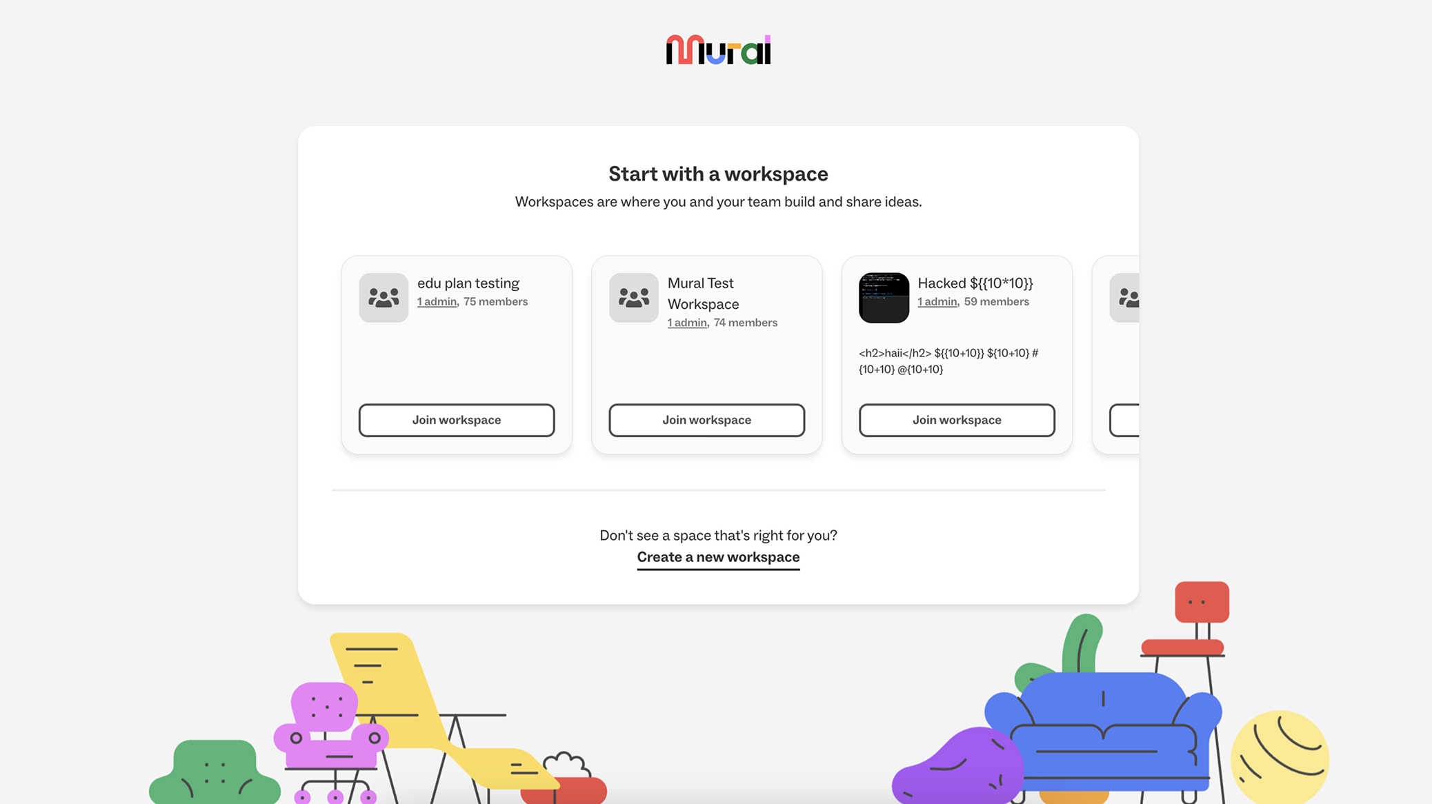
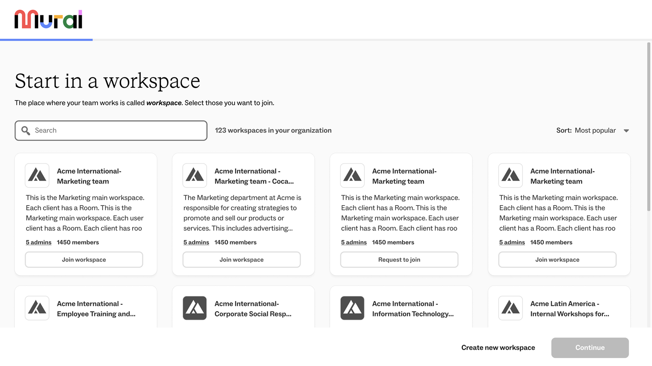
Improved microflows: We polished adjacent flows like password recovery, code verification, and workspace joining, a flow especially relevant to MURAL's enterprise customers.

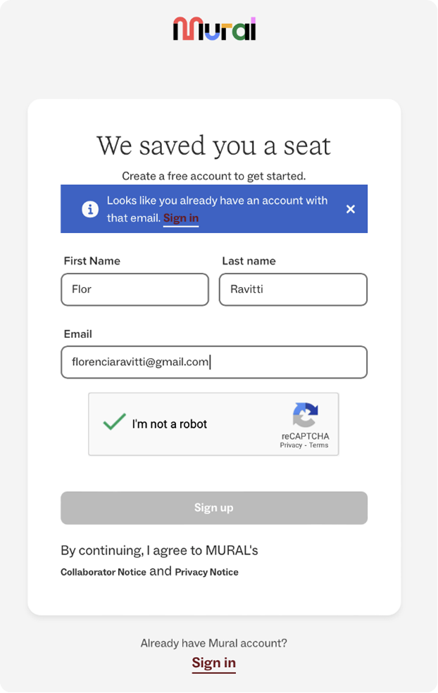
Added 4 profiling questions despite the friction tradeoff. The marketing and personalization team needed first-party data we weren't capturing: 4.5% of users were dropping off during the profiling questions. We knew adding questions would introduce some friction, but I placed them post-account creation, out of the critical conversion path, and framed them as a benefit to the user. The bet paid off: completion improved and the data reshaped how the team approached onboarding in new initiatives.
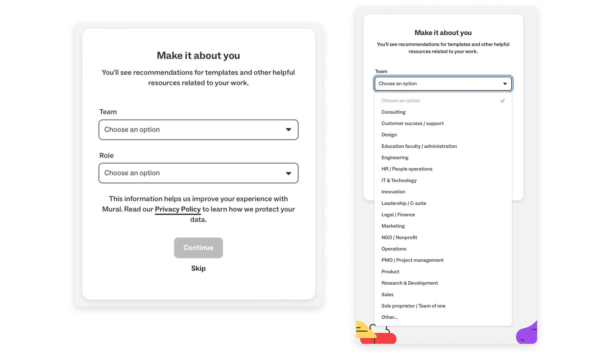
Renaming "Sign-in" to "Login." A small copy change that required real cross-team buy-in, which significantly reduced customer success tickets related to the authentication flow.
The hardest part of this project was delivering quality for the user without neglecting the needs of the stakeholders involved. Getting alignment on the profiling questions was the clearest example. Marketing wanted them upfront, in the critical conversion path. I pushed back, arguing that placing them post-account creation, after the user had already committed, would protect conversion while still capturing the data. The design team's position was to not add the questions to the flow at all. That position required trust from marketing and a clear hypothesis. The results validated the call.
I also introduced something the team hadn't had before: a shared measurement framework defined before design started. This refocused the conversation on "does this design move a metric that supports our goal," which made decisions faster, reduced rework, and gave the team a way to defend design choices to leadership with data rather than opinions. That practice outlasted the project.
After the April 2025 launch, the hypothesis held: removing friction and sequencing data capture more thoughtfully produced significant gains:
The profiling data also surfaced additional information we didn't have: 70% of users had never used a visual collaboration platform. That single insight changed how the team talked about MURAL's market position and reshaped the onboarding strategy.
One thing I'd do differently: push for qualitative research earlier. We relied heavily on funnel data to identify where people dropped off, but had limited signal on why. The 84% first-page drop-off told us where the problem was, not what was going through users' minds. In this case, given that the flaws were evident and validated across the whole company, we moved forward on educated guesses that turned out to be right. But for the microflow of users joining an existing workspace when signing up for the first time, we ran only internal usability tests and proposed a solution that turned out to be too biased toward the recruited participants, so we wasted time on a first version that we had to discard entirely and start over.
The thing I'm most proud of isn't the conversion number. It's that this project established a different way of working, where design proposes and co-owns the success metrics with product, not just the user flow.